[TASK 1] IELTS Writing Sample Pack 1 - Multiple Tables/ Graphs/ Charts
Bộ sưu tập: IELTS
Số câu hỏi: 15 câuSố mã đề: 1 đềThời gian: 1 giờ
209,936 lượt xem 16,148 lượt làm bài
Bạn chưa làm đề thi này!
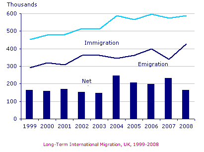
The below chart gives information the data of immigration, emigration and net migration in UK between 1999 and 2008.
Summarise the information by selecting and reporting the main features, and make comparisons where relevant.
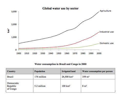
The graph and table below give information about water use worldwide and water consumption in two different countries.
Summarise the information by selecting and reporting the main features, and make comparisons where relevant.
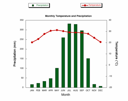
The climograph below shows average monthly temperatures and rainfall in the city of Kolkata.
Summarise the information by selecting and reporting the main features, and make comparisons where relevant.
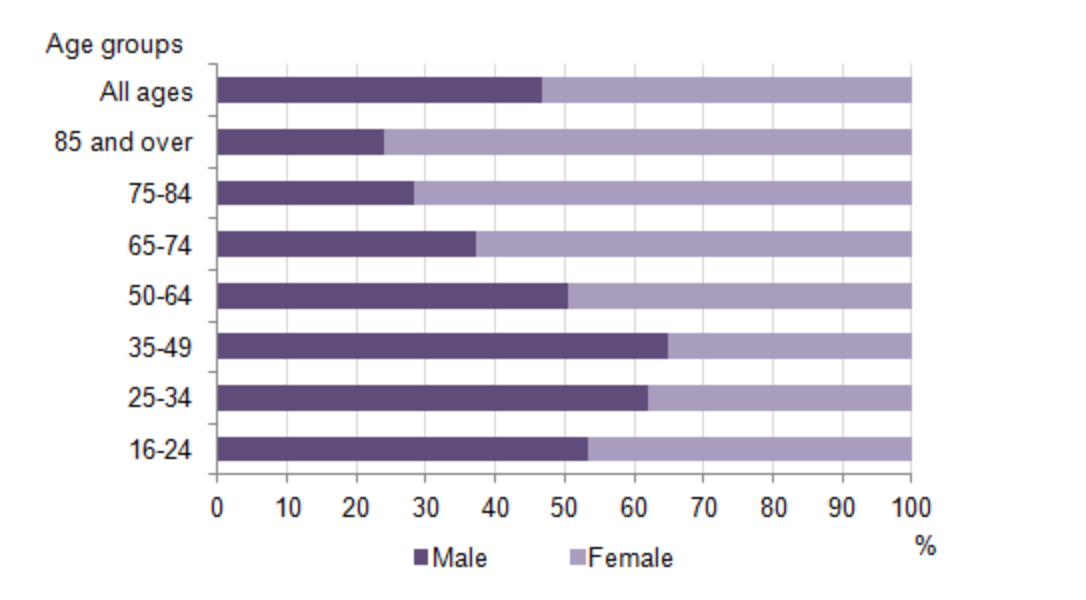
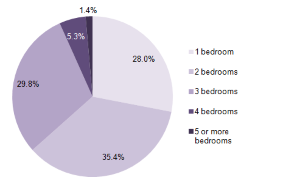
The bar chart below shows the proportions of English men and women of different ages who were living alone in 2011.The pie chart compares the numbers of bedrooms in these one-person households.
Summarise the information by selecting and reporting the main features, and make comparisons where relevant.
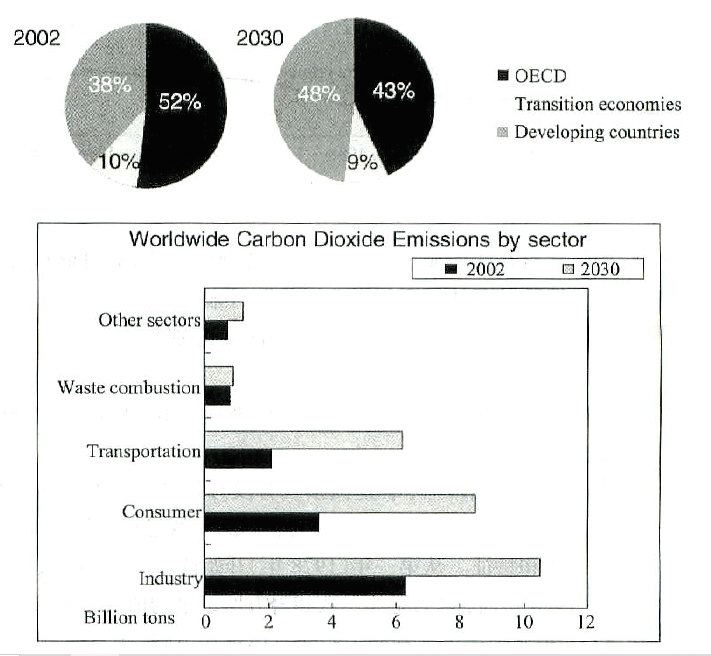
The pie graphs show greenhouse gas emissions worldwide in 2002 and the forecast for 2030. The column chart shows carbon dioxide emissions around the world.
Summarise the information by selecting and reporting the main features, and make comparisons where relevant.
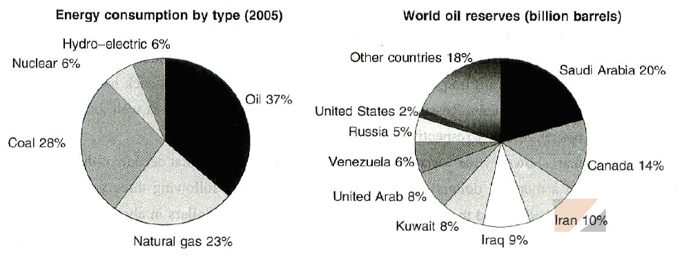
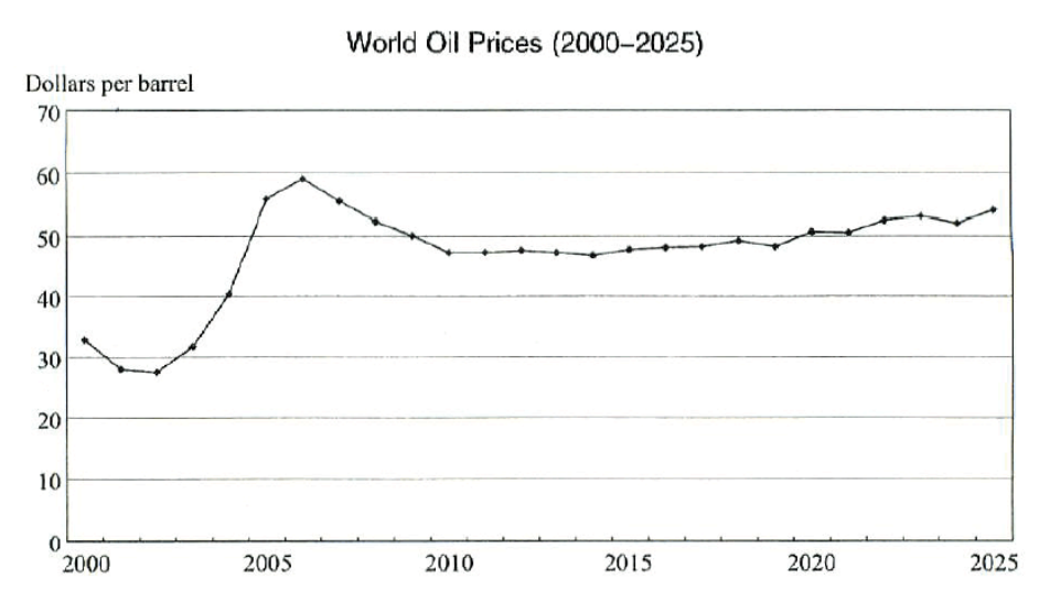
The graphs provide information about worldwide energy consumption, the countries with oil reserves and the world oil prices from 2000 to 2025.
Summarise the information by selecting and reporting the main features, and make comparisons where relevant.
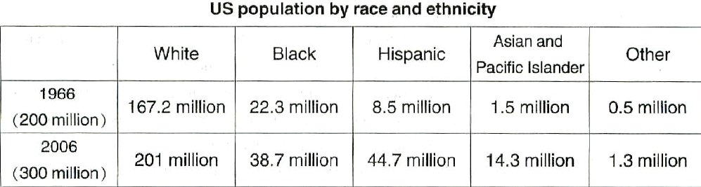
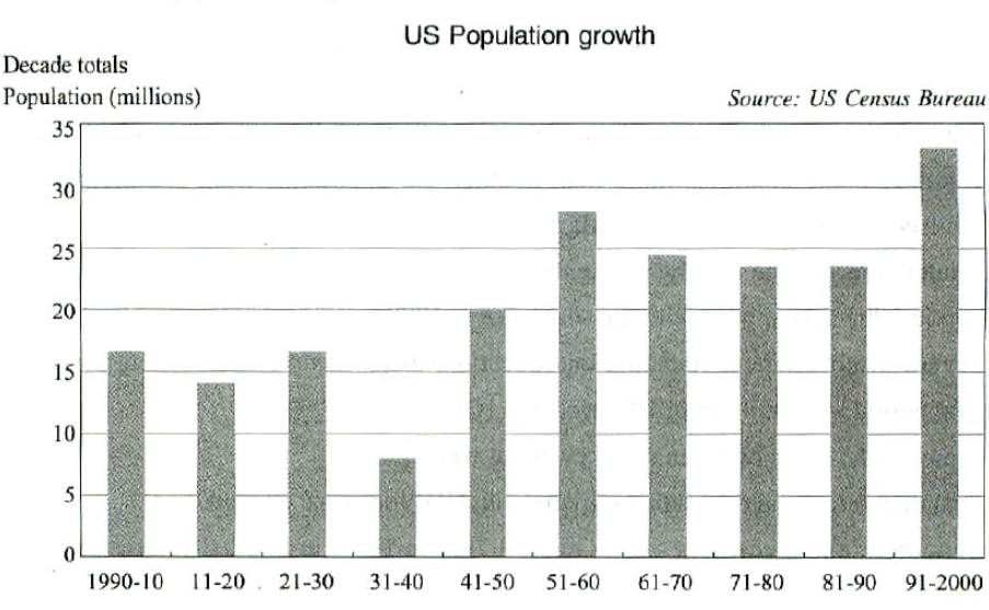
Graphs below provide the latest figure about the demographics of the US, including ethnical groups and the population, based on a census that was carried out and administered by US Census Bureau in 2006.
Summarise the information by selecting and reporting the main features, and make comparisons where relevant.
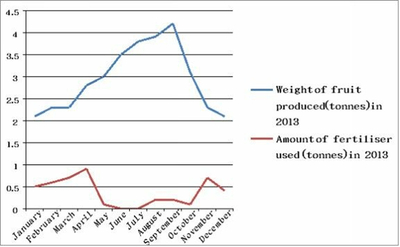
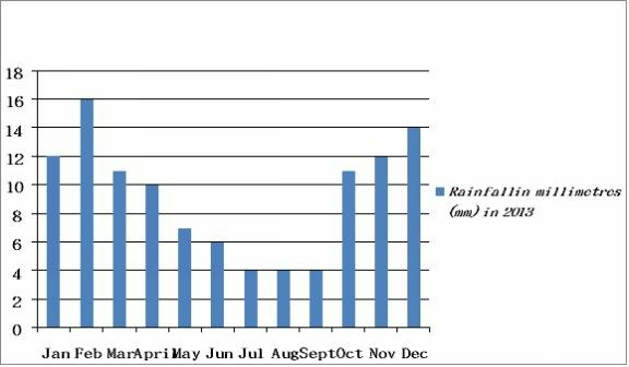
The first graph below shows the weight (in tonnes) of fruit produced by a farm during each month in 2013, and also the amount (in tonnes) of fertiliser used. The second graph shows the volume of rainfall in each month (in millimetres).
Summarise the information by selecting and reporting the main features, and make comparisons where relevant.
The charts below compare five different countries, showing the electricity used (measured in megawatts or mw) in a typical hospital during one week, and also the number of emergency medical calls made by local residents during the same week. The last chart shows the average time (in minutes) spent on assessing emergency cases by hospital medical staff before the patients are treated.
Summarise the information by selecting and reporting the main features, and make comparisons where relevant.
Chart 1 (below): Electricity used (megawatts or mw) in a typical hospital
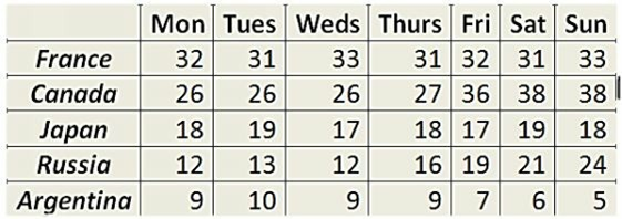
Chart 2 (below): Number of emergency medical calls made by local residents
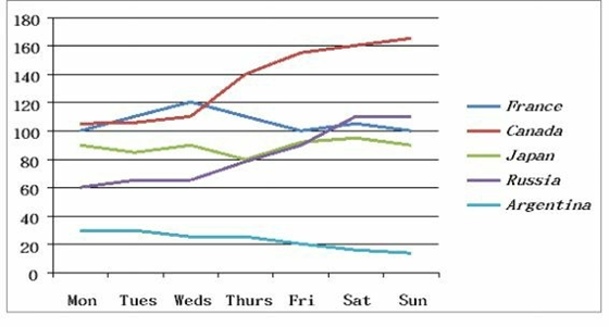
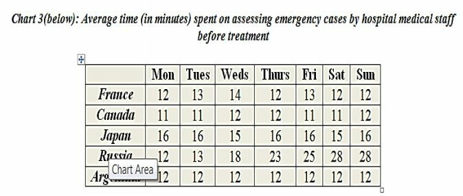
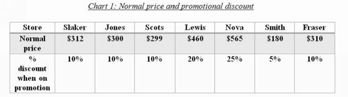
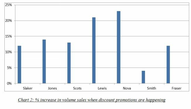
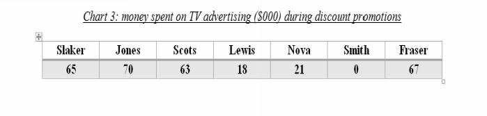
Chart 1 below shows the normal price of a tablet computer in different stores (in US dollars), and the % discount offered by these stores when the products are sold on promotion. Chart 2 shows the % increase in volume sales when the discount promotions are happening, and Chart 3 shows funds (in 000 US dollars) spent on TV advertising during these promotions.
Summarise the information by selecting and reporting the main features, and make comparisons where relevant.
Charts 1 and 2 below show the proportion of income spent on different areas by young people in Canada and Poland. Chart 3 shows the average age of certain life events for these countries, and an estimated global average age.
Summarise the information by selecting and reporting the main features, and make comparisons where relevant.
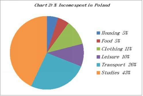
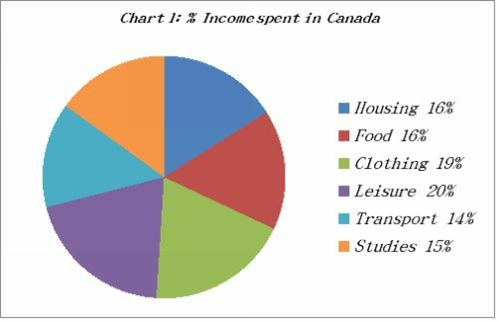
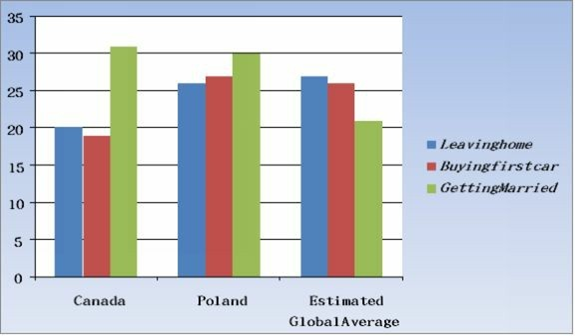
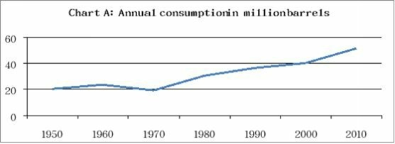
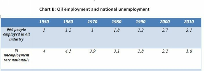
Chart A below shows the rate of oil consumption (in millions of barrels) in a small country from 1950 to 2010. Chart B shows the number of people employed in the oil industry in that country, and also the rate of unemployment throughout the country over the same time.
Summarise the information by selecting and reporting the main features, and make comparisons where relevant.
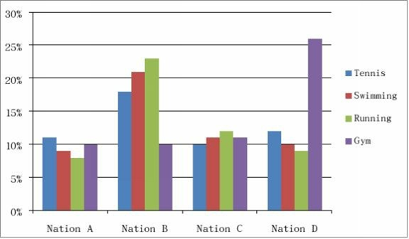
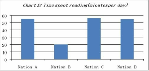
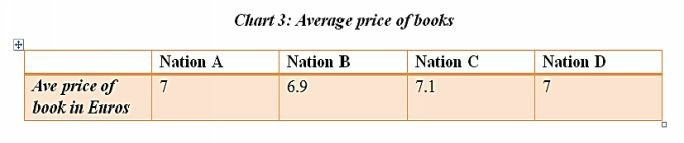
The chart below gives data about the popularity (% of people doing regularly) of various sports in different countries. The graph shows the amount of time that people in those countries spend reading books, newspapers or Internet articles per day. There is also a table showing the average price of books.
Summarise the information by selecting and reporting the main features, and make comparisons where relevant.
Chart 1: Popularity of sport
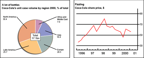
The chart and graph below give information about sales and share prices for Coca-Cola. Summarise the information by selecting and reporting the main features, and make comparisons where relevant.
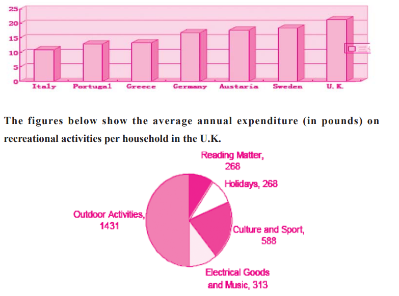
The figures below show spending on leisure activities as a percentage of total household spending in seven European countries.
Summarise the information by selecting and reporting the main features, and make comparisons where relevant.
1,342 xem
1 mã đề 6 câu hỏi
1 mã đề 16 câu hỏi
1 mã đề 13 câu hỏi
1 mã đề 16 câu hỏi
1 mã đề 7 câu hỏi