[TASK 1] IELTS Writing Sample Pack 1 - Line Graph
Bộ sưu tập: IELTS
Số câu hỏi: 13 câuSố mã đề: 1 đềThời gian: 1 giờ
202,847 lượt xem 15,602 lượt làm bài
Bạn chưa làm đề thi này!
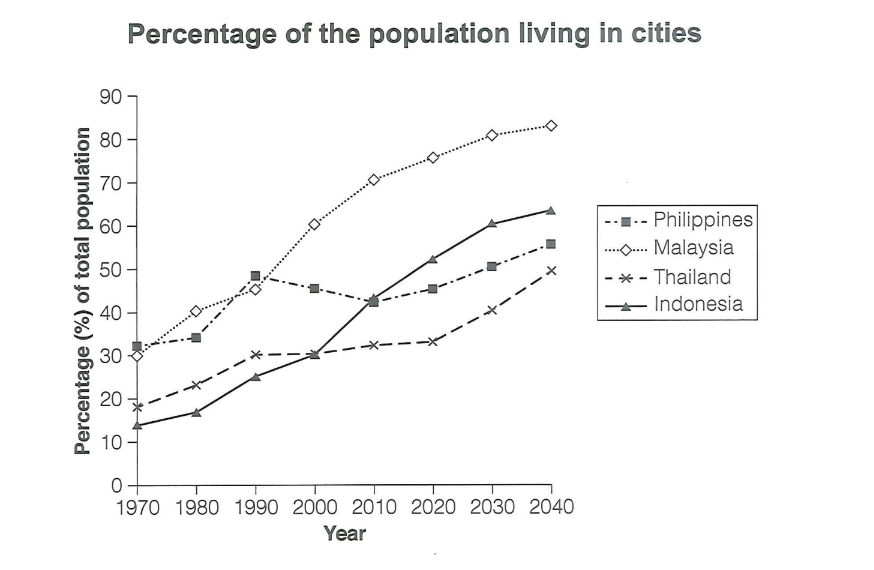
The graph gives information about the percentage of the population of four different Asian countries living in cities between 1970 and 2020 with additional predictions for 2030 and 2040.
Summarise the information by selecting and reporting the main features, and make comparisons where relevant.
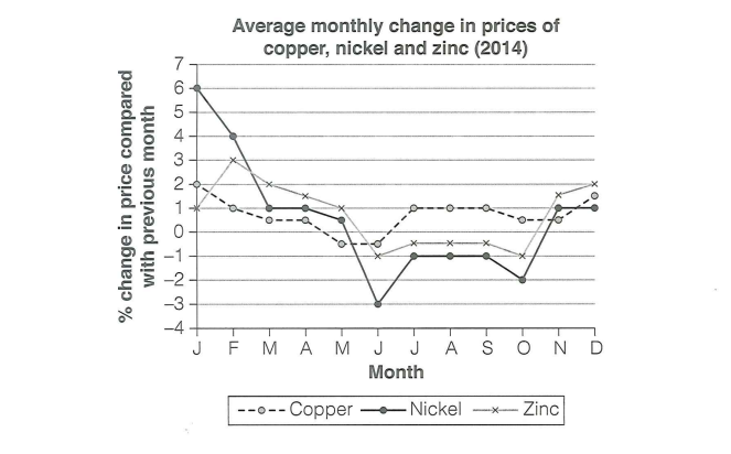
The graph below shows the average monthly change in the prices of three metals during 2014.
Summarise the information by selecting and reporting the main features, and make comparisons where relevant.
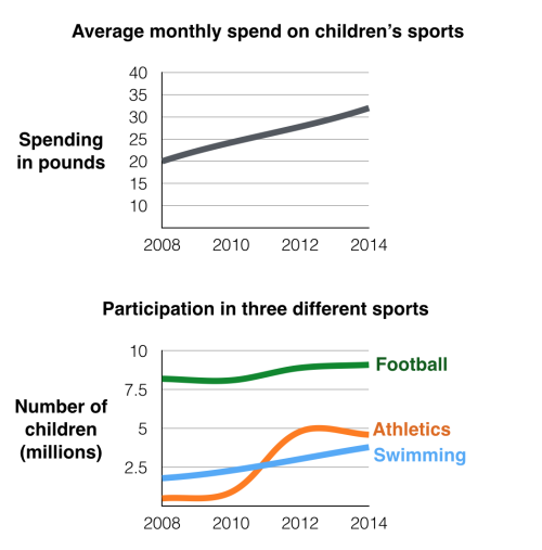
The first chart below gives information about the money spent by British parents on their children’s sports between 2008 and 2014. The second chart shows the number of children who participated in three sports in Britain over the same time period.
Summarise the information by selecting and reporting the main features, and make comparisons where relevant.
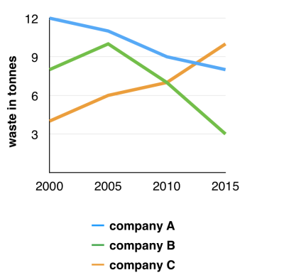
The graph below shows the amounts of waste produced by three companies over a period of 15 years.
Summarise the information by selecting and reporting the main features, and make comparisons where relevant.
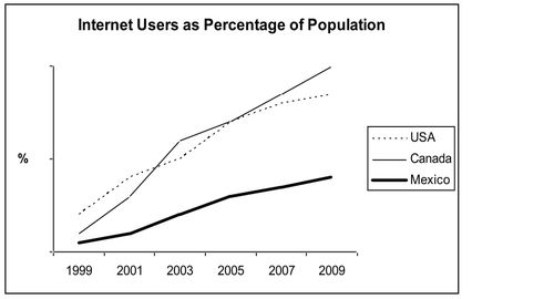
The line graph compares the percentage of people in three countries who used the Internet between 1999 and 2009.
Summarise the information by selecting and reporting the main features, and make comparisons where relevant.
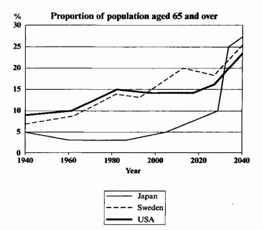
The graph below shows the proportion of the population aged 65 and over between 1940 and 2040 in three different countries.
Summarise the information by selecting and reporting the main features, and make comparisons where relevant.
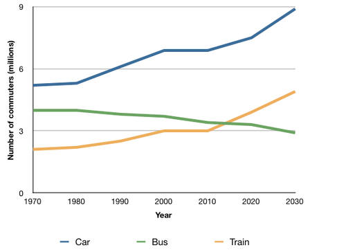
The graph below shows the average number of UK commuters travelling each day by car, bus or train between 1970 and 2030.
Summarise the information by selecting and reporting the main features, and make comparisons where relevant.
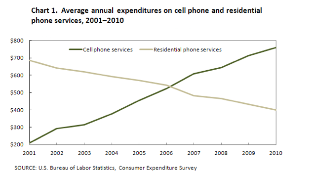
The graph below shows US consumers' average annual expenditures on cell phone and residential phone services between 2001 and 2010.
Summarise the information by selecting and reporting the main features, and make comparisons where relevant.
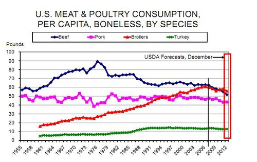
The graph below shows trends in US meat and poultry consumption.
Summarise the information by selecting and reporting the main features, and make comparisons where relevant.
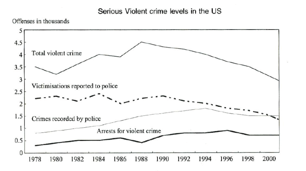
The line chart below shows serious violent crime levels from 1978 to 2000 in the USA. Serious violent crimes include rape, robbery, aggravated assault and homicide.
Summarise the information by selecting and reporting the main features, and make comparisons where relevant.
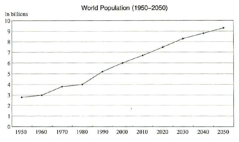
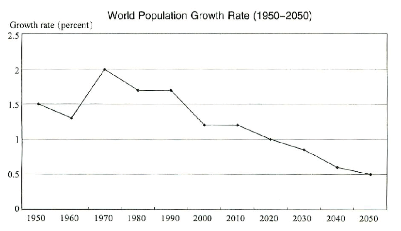
The diagrams below present the estimates and projections of world population from the US Census Bureau.
Summarise the information by selecting and reporting the main features, and make comparisons where relevant.
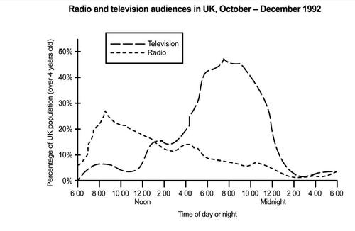
The line graph demonstrates the percentage of UK population who are aged over 4 years old following the radio and television during the October-December period in 1992.
Summarise the information by selecting and reporting the main features, and make comparisons where relevant.
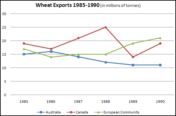
The graph below shows the differences in wheat exports over three different areas.Write a report for a university lecturer describing the information shown below.
Summarise the information by selecting and reporting the main features, and make comparisons where relevant.
1,342 xem
1 mã đề 6 câu hỏi
1 mã đề 16 câu hỏi
1 mã đề 15 câu hỏi
1 mã đề 16 câu hỏi
1 mã đề 7 câu hỏi